
This is a personal brand identity project for my artwork. I have two distinct art styles: cute doodles VS nature landscapes. The goal of this project is to develop an identity that represents and unifies both art styles.
PROCESS


1. Terracotta Pots
2. Daisy Fields
3. Chasing Skies
This direction gives a polished feel through its rich colors, geometric shapes, and serif typography.
Daisy Fields evokes a light and airy feel through its white space, pops of color, and handwritten typography.
This direction has a playful style through organic shapes, pastel colors, and cute graphics.
concept development
I moved forward with Terracotta Pots because of its richer color palette and polished feel which allows for more flexibility with both of my art styles.
final concept
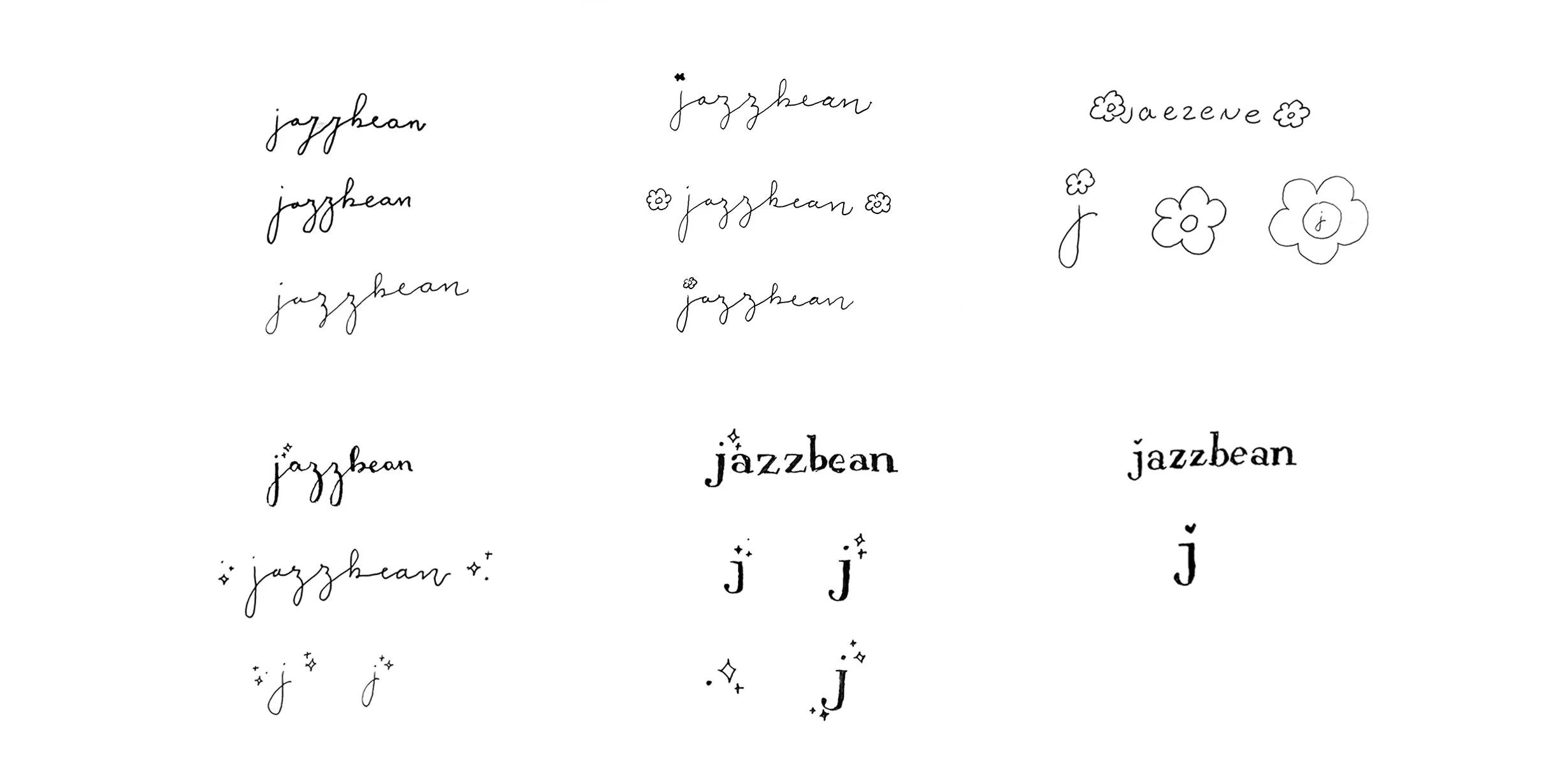
sketching
I explored ways to integrate a polished feel in handwritten calligraphy and serif type as well as iconography.
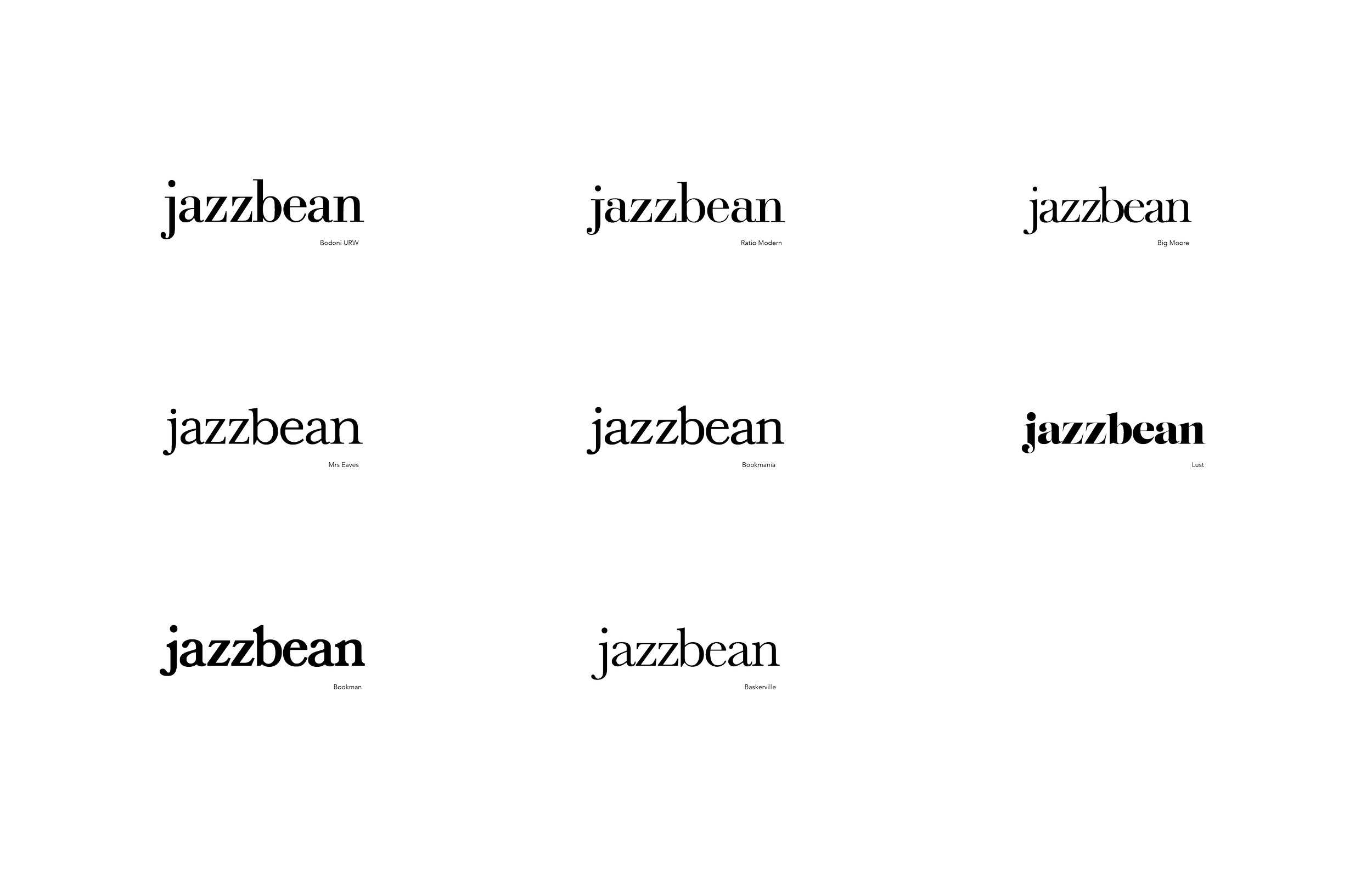
type studies
After sketching, I decided that a serif typeface had more flexibility with integrating iconography. I conducted a type study to see which typefaces served as a middle ground between playful and formal.

ITERATIONS
To make a final decision, I placed the type in context with iconography that matched their styles.

FINAL LOGO

→ process book
Wanna see more? Click above to see more process work.